Freckle Responsive Student Dashboard
Freckle helps K-12 teachers differentiate instruction and reach every student at their own level across Math, ELA, Social Studies, and Science. Before Covid-19, the platform was sufficiently working in most school scenarios; however, Covid-19 created a need for the product to be responsive to allow students equitable access. In addition, the engineers had been long-suffering without any component libraries or style guides. Lastly, we had a separate initiative to make the student dashboard more engaging. I worked with the team to create a roadmap strategy & vision for a Responsive dashboard and then delivered a research-backed design.

Many problems to solve at once
Making freckle equitable & accessible for students practicing at home was of course our top priority - we had data proving that it was significantly affecting many student populations.
Not only that, students with different learning styles had significant barriers to learning because the user interface was inconsistent across many practice modes - which made it tricky especially for younger students of those with disabilities.
Our Engineers and Designers had also long complained that there wasn’t a style guide or shared component library to lean on, making each new feature a one-off.
We wanted to solve all of these critical problems at once but our Engineering and Product teams were also juggling other important teacher-focused objectives.
Therefore, it was crucial to develop a strategy that supported all of these goals and dependencies at once.


Based on our early workshopping, I created a North Star screen flow map that we used throughout the duration of the project.
Kicking off discovery
First, I drafted a shared assumptions document to capture all the problem areas, goals, dependencies, and success metrics. I also ensured we had an engineering contact and product manager to collaborate with.
Our objectives were to:
1- Increase students able to complete practice on a phone
2- Decrease cost for us to build features by improving components
We identified the highest traveled pathways for students and the most assigned practice types by teachers.
In addition, I worked with engineers to audit all of our screens and flows to create a rough map of the student dashboard that could serve as a place for shared understanding. I also worked closely with engineers to understand our engineer and designer needs in terms of a component library.
After some low effort, scrappy design thinking workshops with the engineers and product, and a round of Kid testing with early prototypes, we were able to identify a set of milestones.
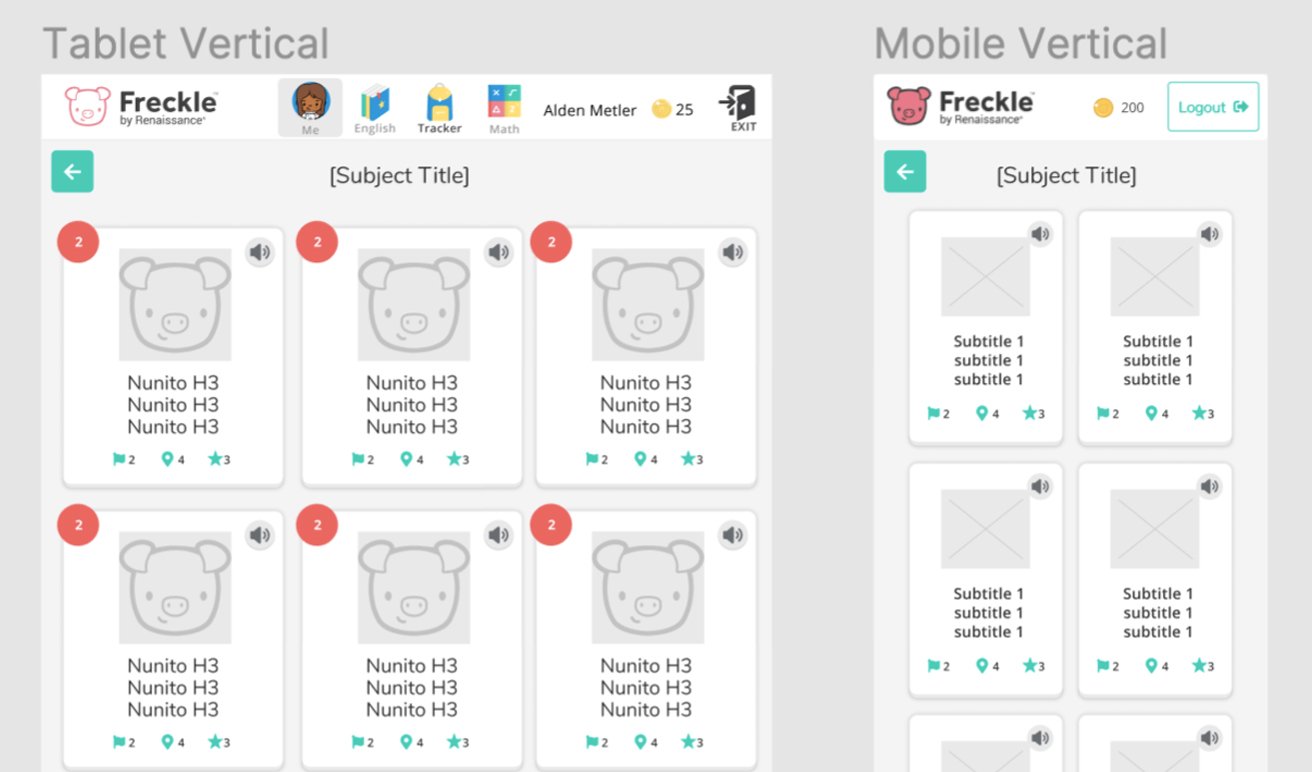
Component-based Responsive “Wrapper” experience
We determined that the highest value thing to start with was to roll out responsiveness to a new “wrapper” because it is the core part of the experience we knew would target ALL students using the product, not just some. All students would benefit from responsive navigation.
All of these flows went through extensive Kid testing and engineering review to ensure any new design patterns were usable and feasible.
During this phase, we tackled:
log in
Differentiated guided homepage
Assignments
Selecting a practice type
New interstitial screens to replace wonky modals
New Summary Screens and reward screens
BONUS! Engineers were excited to let me add new delighters with .json animations while we rolled this out! This was the first time we added .json to the site, and we have since been using it whenever possible, because it’s so easy to implement.


Responsive math practice UI
We decided that Math practice was the highest priority for students practicing at home, because it is the most assigned subject in Freckle, and the subject we sell the most to schools.
I worked with engineers to create a super flexible set of responsive screens and components for math that could be repurposed down the road on our other subjects & practice types.
We rolled out many changes to the UI during this phase, strategizing small measurable updates over a series of iterations.


Responsive, differentiated progress tracking
Freckle is differentiated based on grade level, to support younger students and older students differing needs.
I designed 2 versions of the assignment & progress tracking screens so that younger students received more guidance to assignments and less data tracking.
Older students who tend to monitor and track their progress more often were provided progress monitoring features and kpi metrics that increased motivation to practice.
I designed a set of components and layouts to support each scenario.
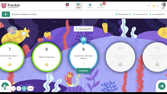
Adaptive Math Pathway
Before these updates, it was technically possible to navigate the math level progression screens on a phone, but they were cumbersome and poorly designed.
The information presented was also confusing, and redundant, requiring lengthy scrolling and information far below the fold. They also weren't tied to components.
Luckily for me, we had a second objective during this quarter, which was to increase student engagement. This was a blessing because it allowed me a little more leverage to float big ideas!
I pitched a new set of layered parralaxing backgrounds, each with a different world, where kids would be encouraged to visit and unlock over time. I also was able to add in the concept of a mystery prize, unlocked at grade-level goals.
I proposed hiring an illustrator to help us create these worlds while I worked ahead on other features.
First, I created a rough illustration and some placeholder illustration assets that our engineers could use to build a simple prototype. I used this to created my initial budget for the 17+ layered backgrounds.
I created a budget, got approval from stakeholders, and then hired the illustrator. I was then able to act as a creative director while she created the beautiful illustrations.
The Freckle team will be able to expand on this core idea into the future. I can’t wait to see how they expand on this area of the product!

The redesigned math navigation screens were the highlight of this project. I was able to introduce myster prizes into the fold, and hired an amazing illustrator to design 13+ amazing parrallax backgrounds. We worked closely together on the backgrounds.


Kids middle school age and up saw an aged up background style, more icon and shape based, while younger students recieved the cute animal based backgrounds.
The Results
The responsive Wrapper and math practice modes have been successfully rolled out, and in the time we estimated it would take. Freckle works iteratively, so there is still work to be done. I’m incredibly proud of what we were able to achieve, the collaboration was stellar! I’m looking forward to seeing the English practice modes being updated sometime this year!